Uplifting digital presence through user-centred design
After a rebrand, QIC required a total overhaul of their existing website and authoring experience.
The brief
QIC (Queensland investment corporation) is a government owned investment company, primarily investing in shopping centres and other real estate. QIC were looking for a full upgrade to their authoring capability, as their current website only allowed them to create basic articles. Having undergone a recent brand refresh QIC wanted to their new website to reflect the re-brand.
SECTOR
- Finance
Services
- UX Design
- Digital Brand
Discovery
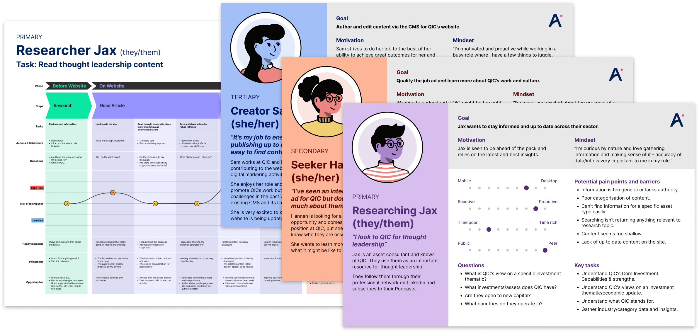
Stakeholder workshops with the QIC team, resulted in the creation of behavioural personas and customer journey maps to understand who and how their users are expected to engage with the website.
We wanted to understand who is coming to the QIC website and why they are there. For example understanding that, like many B2B sites, the primary audience is on desktop, not mobile. QIC does not sell a discrete product or service, their website isn’t the main channel for sales or communication. The actual business happens over phone calls and meetings and with quite a long lead time. Overall we learned that the website has two main objectives: direct potential new clients to contact QIC, and distribute in-house content like podcasts, news articles, white papers and videos.
The in-house content was not as accessible as it could be, being split across several pages with vague titles as a result of a poor exisiting IA. Contact info was also not as clear as it should’ve been. QIC has several points of contact, but many of them were hidden within articles and the contact page was just a message form. As a result, QIC was not effectively communicating with their clients and was missing out on opportunities to engage with them.
Lo-fidelity design
Our personas and journey maps informed an updated IA and a set of wireframes. The new IA was deliberately much shallower, with long form content confined to the bottom level. We added clear CTAs for contact info and expanded the contact page to include a directory of office details and media contacts.
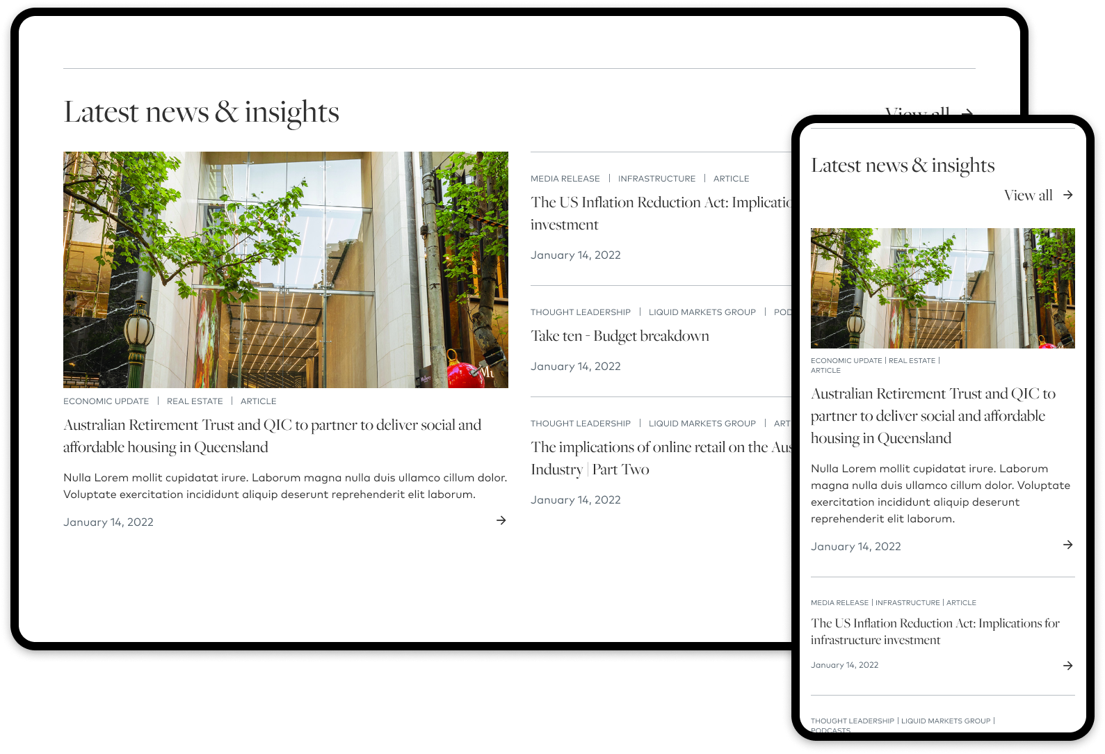
The navigation remained divided into the About/Capabilities/News and Insights (previously known as Knowledge center), but the structure of each section was revised. The News and Insight section in particular underwent a large overhaul. Rather than different categories for news and reports being awkwardly divided among multiple pages, it became a single aggregate page of all the media and content QIC produces, with faceting to allow users to drill down to the content that is relevant to them.
Testing and validation
The Lo-fidelity designs (wireframes) were used to create a working prototype for the QIC team to run internal user tests. The prototype site allowed testers to freely click around the website. Taking advantage of Useberry, we tasked them with finding specific information or performing a task within the prototype. This could range from finding some contact details to performing a site search and applying filters. The testing results confirmed our assumptions that simplicity is key to achieve the two main objectives outlined earlier.
We had an 86% completion rate with the majority of tasks completed in under 25 seconds.
Hi-fidelity design
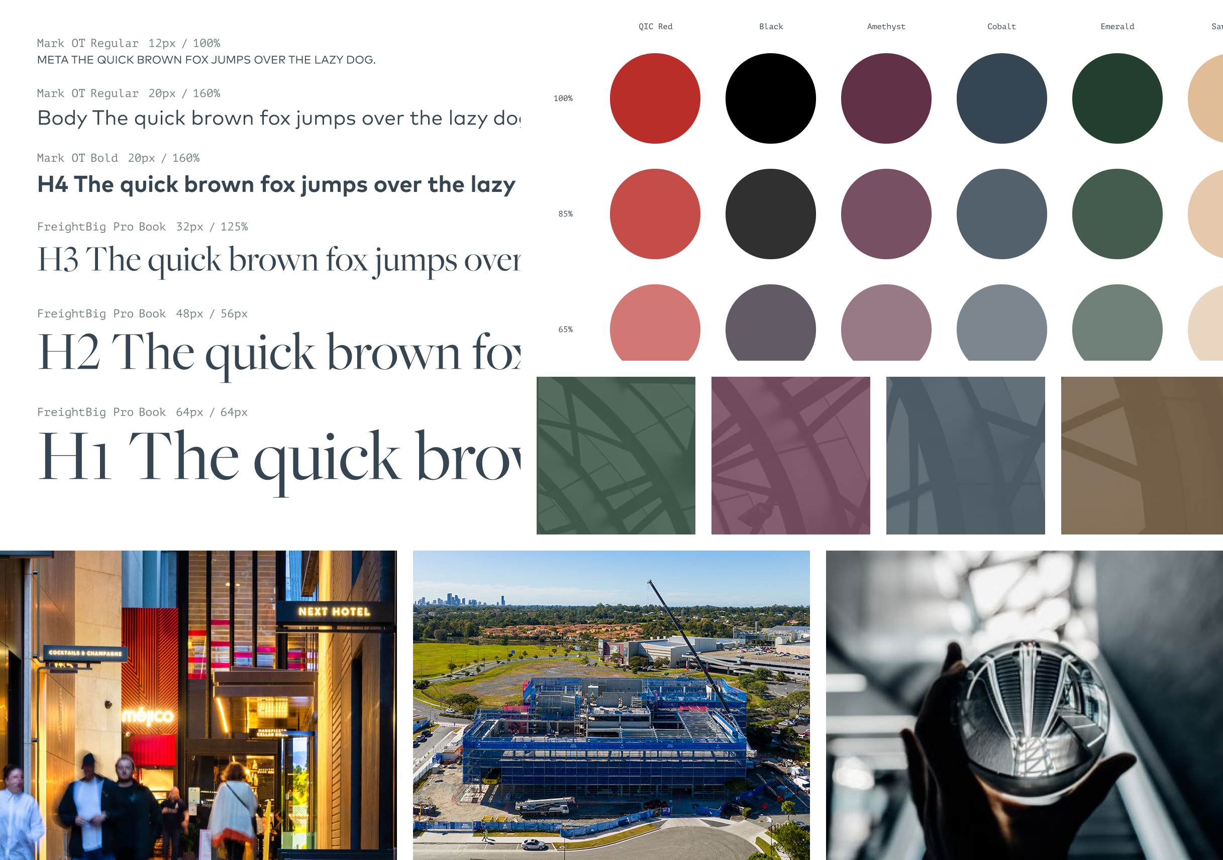
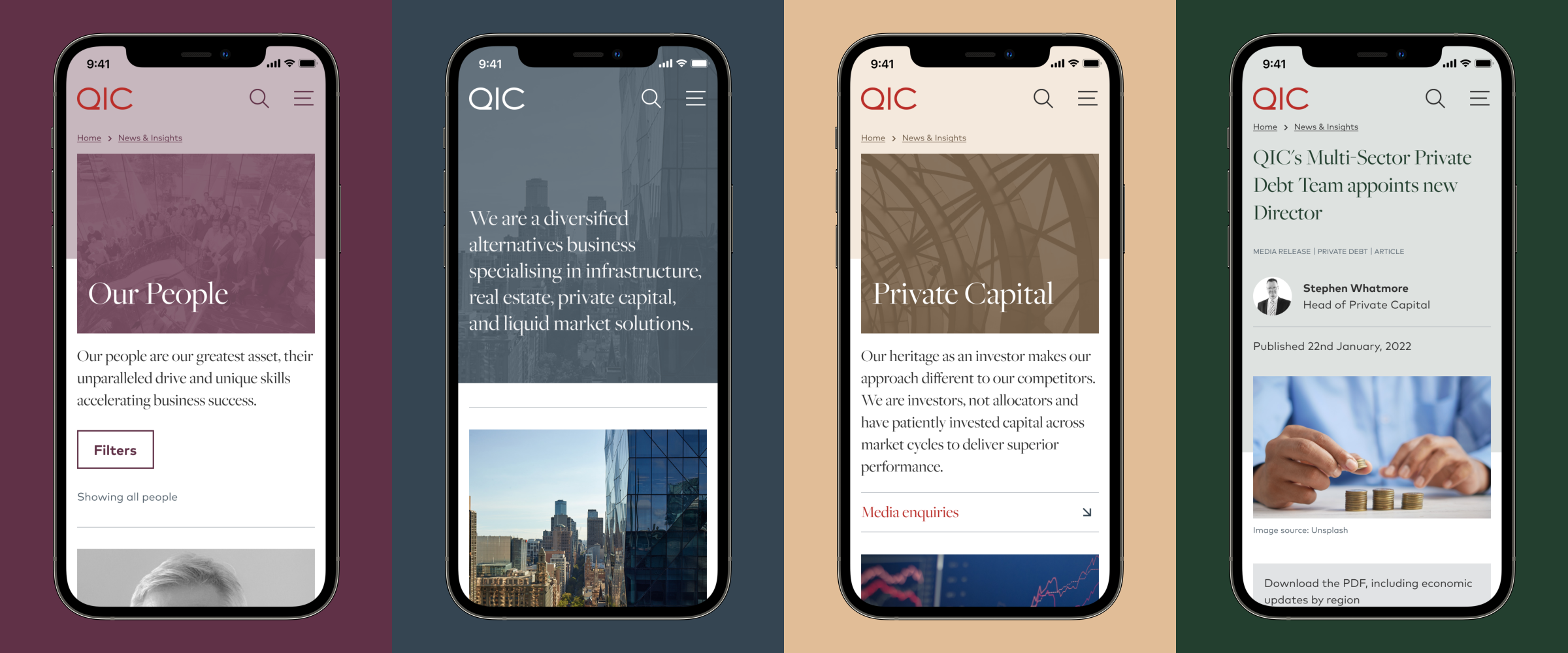
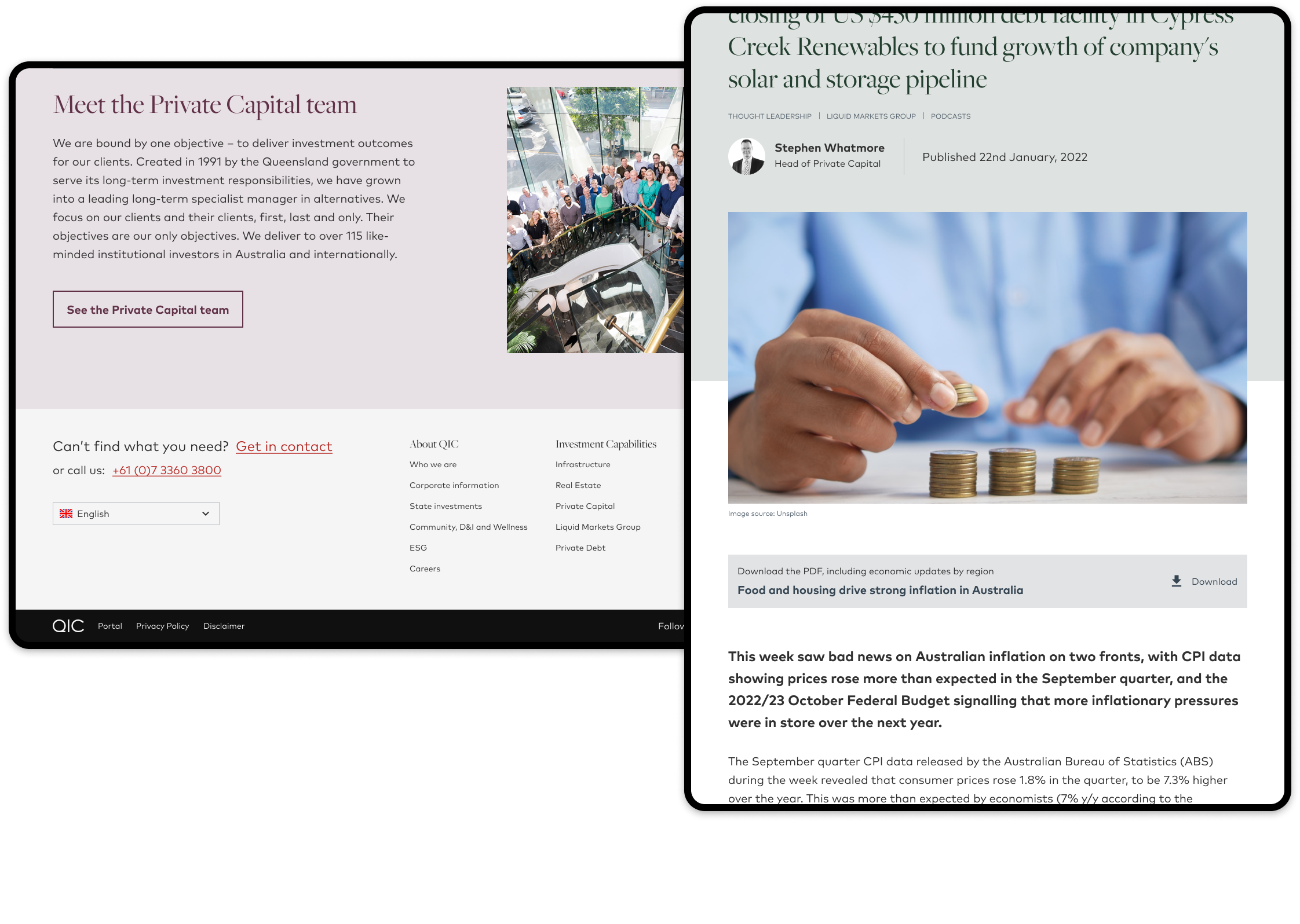
From Lo-fidelity to Hi-fideltiy we incorporated QIC’s updated brand into the wireframes to produce draft concepts of how the new branding my look. Through sprint based rounds of iteration and feedback these were refined to final design language (design system light) for the new website.
We designed with QIC’s authoring requirements as priority, greatly expanding the capability of their content authors with new text styles and components to be used across their website as part of a composable approach. We worked closely with their team to ensure they would have all the tools they needed to build the ideal website.
Thank you
From the project team at Aceik, thanks to QIC for their contributions and insights during the project.
If you would like to find out how we might help you with your User Experience or Digital Brand needs get in touch.


